“Graffiti”
So there’s this cute little PSA animation running around from France. It features a very lonely bathroom graffiti penis finding his way into the debauchery of the bathroom walls with the other graffiti. It’s very different work from the animations we’ve been doing in the biomedical visualization department here, but memorable, skillfully animated, and conveying the message of condom usage…
http://attitude.adforum.com/top5/2010/01/27/aides-graffiti-tbwaparis/
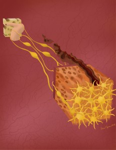
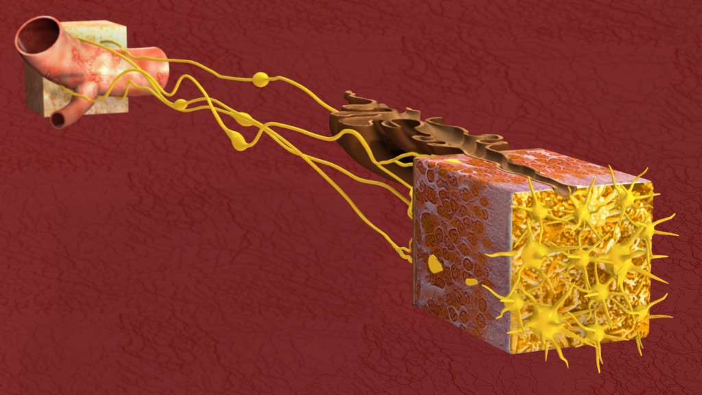
Digital Compositing of The Path Scent Takes
Some of you may remember the primarily Photoshop created version of my olfactory scene from my earlier post, “Just Finished! From Nose to Brain”
Well I have now just finished the primarily 3D developed version of the same image.
This one was created mostly in 3DsMax and then rendered out in separate passes which were then taken into Photoshop for final compositing.
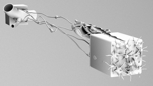
I rendered out a pass both with and without self illumination on the olfactory vessicles, and then moderated between the two versions to find the balance I liked best. I also used a specular pass, though to be honest, that really only added a little to the scene. I had an ambient occlusion pass, which if you haven’t played with those and you do this kind of work, I highly recommend trying it. Here is an example of what an ambient occlusion pass looks like by itself. By placing it as a layer on top of your image and adjusting your settings to multiply, you get a really nice shading effect. Seriously, try it, it’s awesome.
I also rendered out a pass of just the background, as well as an alpha map which I wound up using to adjust my blurring back there.
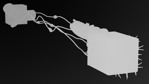
I got that blur by using a z depth pass, which allows you to create digitally the depth of field effect that comes naturally with a camera. This is another of those that is better just seen then described so I will include an image of that pass here as well.
Basically, what you do with this is apply it to a channel in your Photoshop file. Your channels palate is right there along with your layers palate. Once you have it there, you can use it to apply the lens blur filter to your entire piece. It helps if you first merge all the layers of your piece together (or ideally, you duplicate them first and then merge just in case!) The light to dark gradient in the z-depth pass indicates the proximity and distance of the objects in your scene. So long as you have your lens blur settings reading from this channel, you will be able to adjust the depth of field for your image. It’s really cool.
So put it all together and you get finesse!
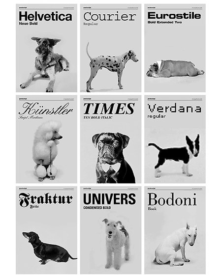
If your dog were a font…
We’ve all heard the old adage of dog owners and their dogs looking alike, but here we have someone who has connected the look of different types of dogs with various fonts. It was created by the design firm of Günter Eder, Roman Breier, and Marcel Neundörfer in Vienna. Cute!
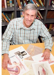
UIC News Features John Daugherty
Looks like Gary Wisby, of the UIC News team has done a nice little piece on one of my program advisers, John Daugherty…
http://www.uic.edu/htbin/cgiwrap/bin/uicnews/articledetail.cgi?id=14017
Textbook Definitions
I have always had a difficult time with vocabulary definitions that I suspect fall short of the word being defined itself. Recently I started an online class in Pathophysiology which uses the book Pathophysiology for the Health Proffessions by Barbara E. Gould.
Now my first impressions of this book have been very positive. I like the layout. It seems easier to skim for what you are looking for in this book than it has in many I’ve owned before. I like the clear and concise level of explanation on a lot of things. When we got to the section on healing, I was very impressed to see alternative and holistic medicines discussed beyond the standard blurb about what some quacks think. I like the listing of literary and web resources at the end of every chapter as a starting place should you want to read more.
I am however finding myself at odds with the way this book defines certain key terms. Some of these seem a bit misleading. In the text, words are emphasized to their contextual meaning, making it easy to assume that the bold faced term, being defined in front of you means specifically what it says. But many of these words are broader than the context given, and should be noted as such. For instance, vasodilation reads in the text as a “relaxation of smooth muscle causing an increase in the diameter of arterioles.” And that would be fine, except that vasodilation isn’t specific to arterioles, it applies to any dilating vessel.
Just now I was looking at the description for glucocorticoids which reads “Glucocorticoids, sometimes referred to as corticosteroids or steroidal anti-inflammatory drugs, are synthetic chemicals that are related to the naturally occurring glucocorticoids (hytrocortisone), hormones produced by the adrenal cortex gland in the body.” So we’ve got a word, that we are defining as a lab made drug, only to use the very same word to express the natural hormone in the body which it mimics.
And I know that these are small points. A second or third read, and I understand exactly what is meant in the glucocorticoid explanation. Vasodilation, does also apply as used in the text, it just means something a little bit broader though. I was totally prepared to rant about anorexia being defined as a “loss of appetite” but I finally found backup for that definition. The book is right, on that one. I guess the point is though, that words matter. And how these terms are expressed in textbooks, especially the ones that we don’t know yet, will affect the way we read and use them and understand new material.
One of the things I find most challenging in studying anatomy and medical sciences is this tendency for important words, and concepts to be expressed in a manner that will only be later contradicted when you learn more. And right now I am suspicious of this book for doing that with words. It’s a shame, because a suspicious student probably doesn’t take in as much as a trusting one. But with so many changing theories and new discoveries happening throughout these fields, I’d personally like for us to work on getting the intended and accurate message out in the first place. Then at least we’re all on a similar page in observing the actual discoveries and changes and not just playing catch up all the time on what our early lessons really meant.
I am a person who cares about words. I may sling them casually at times, but in the end I care about them. I’ve even gotten into more than one ridiculous heated argument about their exact meanings in the past. And I don’t look to discourage anyone from picking up this book (unless of course you’re just looking for a strong glossary in which case you should really be buying a medical dictionary or something like that instead.) I do however hope that any of you writing such a guide, or teaching new students will give careful consideration to the messages implied in what you put forth. Get it right in the beginning. And if you need to simplify, be clear that you are doing so. You always want to leave room for further understanding of the next chapter, not set up conflicting pieces and confusion.
It’s important.
Video Posting
So last night I finally signed up for a Vimeo account. If you’re not familiar with them, these are the guys who’ve basically stepped up the game a bit from YouTube. I posted my Sliding Filament animation there, and it does in fact look better than it did at YouTube even though I still wasn’t able to post my best files. If you’ve ever wondered about the quality difference between the two sites, well here’s a chance to take a compare the same work at both…
At Vimeo – http://www.vimeo.com/9849163
At YouTube – http://www.youtube.com/watch?v=0kFmbrRJq4w
And if not, well then carry on.
Friendship
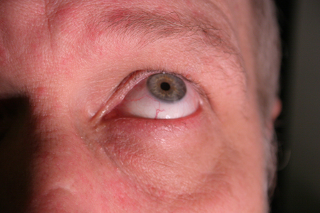
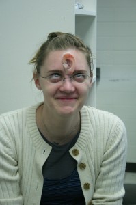
Ahhh, it’s a good friend indeed that stops you while you’re artificially aging the skin around your own eyes in Photoshop and offers you theirs with some good extra years on it.
I am a texture mapping fool!
Breasts
I was taking a look at Street Anatomy the other day, and came across this
If you’ve ever tried to create an informative, eye catching, easy to understand display like this, you know it’s generally not that easy a trick. This one comes from the designers at Good Blog. Nice work guys!
Making an Ear
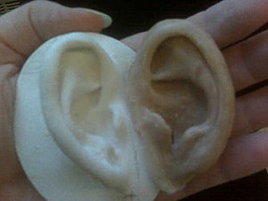
Another project I’ve been working on lately has been to sculpt the ear of one of my classmates.
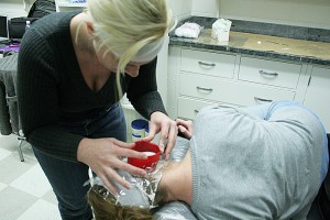
Last year we all took impressions of eachother’s ears using algenate.
The idea is to create a cast of one ear, and then use that cast to create a match for the other side. In anaplastology, this kind of scenario comes up often as a patient may have one good ear, and wish to receive a matching prosthesis for the other side.
The new ear is sculpted using a combination of base plate wax, clay, and a few crayons for coloring. I believe in most clinics models like this are made solely in wax. It is sculpted onto a base plate which is meant to mimic the anatomy of the patient’s head where the prosthesis will be worn.
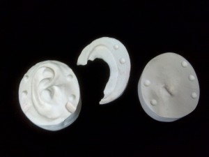
Then just recently we finished off by pouring a plaster mold around the wax sculpture and boiling the wax out, to leave the plaster mold behind.
In another week or so, we will paint colored silicone into the mold and use it to create silicone versions of our wax sculptures.
It’ll be ears for everyone!
Aging
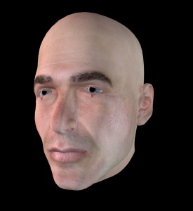
Meet Simon…
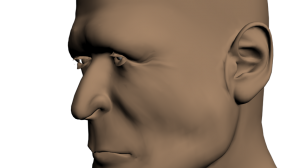
Simon is one of the default figures from the program Poser. I recently grabbed him for use in a 3D animation we are creating about cataract surgery. The thing is, he’s the oldest looking head I could find in our files, but he still doesn’t look old enough to be having cataract surgery to me.
Now, initially, I thought that I could make my facial adjustments in Poser and import that work directly into 3DsMax. The catch with that was, that while there are a lot of cool facial adjustments that Poser allows you to make, the adjusted texture map wasn’t exporting correctly, so you were left without use of the photo realistic skin. I used one such image for the animatic, and simply created a basic skin tone for the figure. Here is one of the stills from that scene and you can see that a lot of work would need to happen to make that skin come across more realistically…
Texture maps are actually pretty strange looking when unwrapped to a 2D plane. So rather than trying to paint a new texture map for this head, and have to guess at where the nose and lips should be to paint them in, I decided to go back to the original Simon with the good texture map and see what adjustments I could make to that outside of Poser.
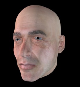
The first area I looked at were the eyes. I wanted to make them baggier and I needed the eyebrows to show some graying. I drew some simple wrinkles into a bump map and placed that into the material in 3DsMax and got the following…
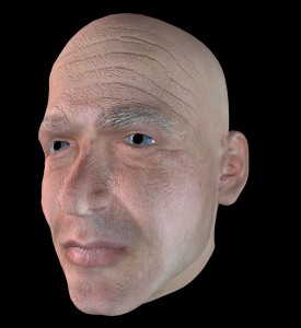
The outcome was a far cry from perfect, but allowed me to see how this was going to work. So I went back to work on it. I further grayed the eyebrows, and started finding good pictures of people with strong wrinkles. This whole week I’ve felt like Dr. Frankenstein, sifting through old people to harvest their wrinkles for my own creation! I also made some minor adjustments to the heads shape itself in 3DsMax using the paint deformation modifier. This allowed me to push and pull certain areas without ruining the texture map’s positioning. Stamping wrinkles into a bump map layer in Photoshop, I wound up coming up with something like this…
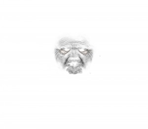 ..which when applied as a bump map to the head’s material, gives you awesome wrinkles!
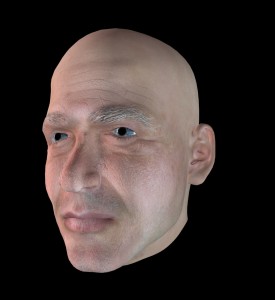
And in his latest incarnation, he has been toned down to look like this…
He still needs a little more work, but for now, I’m really happy with the aging I’ve managed to get on him. The shape changes are subtle, but they help. The wrinkles are playing off pretty naturally, and I’m really excited about that. I just need to find a few more and then I can go into futzing with the way the skin handles light.
Overall though, this has just been a really neat project. So often when we think about aging, it’s a worry, it’s unwanted. But this has been an awesome chance to just study faces and enjoy how cool some of these “ravages of time” really are. I like that our faces change over our lives. It’s neat. Someone reminded me recently that wrinkles run perpendicularly to muscle striations in the face, and looking at so many of them for so long, it feels like a very human thing. It’s like, in time we reveal our inner workings, let down the mask a little. Don’t get me wrong, I’m not exactly anxious to take on so many lines myself here yet, but they are neat. They tell a story. And aging this little digital man is really fun.
