Archive for the ‘video’ tag
Pixels and Whatnot
A lot of people get confused when you bring up things like aspect ratio, resolution, image size, and all the related terminology around those things. To be honest, sometimes I do too, and I work with this stuff all the time.
So let’s begin with image size. I think that most people generally understand basic measurements when they are not in the context of the other components I’m talking about tonight. Well, the good news is that a given number of inches or centimeters is still a given number of inches or centimeters. And the only time you’re going to see a big fluctuation in size is when resolution comes in to play.
Resolution refers to how many units of information are packed into a given increment of size in an image (or a video). You’ve heard the expression dots per inch (dpi) or pixels per inch (ppi). Well if someone gives you the size of an image in pixels, then you’ll have to know the resolution to know how big it is in inches or centimeters. If an image is 100 pixels by 100 pixels, it will be one inch by one inch at 100 ppi, or just a third of an inch by a third of an inch at 300 ppi.
72ppi is generally thought of as the standard screen resolution, but the truth is that most monitors today actually display something more like 100ppi. This is why when you create an image in a program like Photoshop that allows you to say that you want something to be a certain measurement in inches, it often displays a little bit smaller on your screen. It’s just taking less physical space to display the allotted number of pixels in the image. So long as everything is working right though, the same image should print still print to size, because the image’s settings contain the information that it is to be printed at a resolution of 72dpi. Usually, when one is intending to print though, they use a higher resolution. 300dpi is a common standard for color printing. And surpringly (at least it was to me) black and white images are often printed at even higher resolutions. And line art in particular is generally done at a very high resolution. I think that back when I was in grad school we were keeping our line art files at 1200dpi. Using such a high resolution ensures a cleaner line. It also takes up more space on your computer, but such are the sacrifices we make for art.
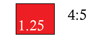
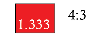
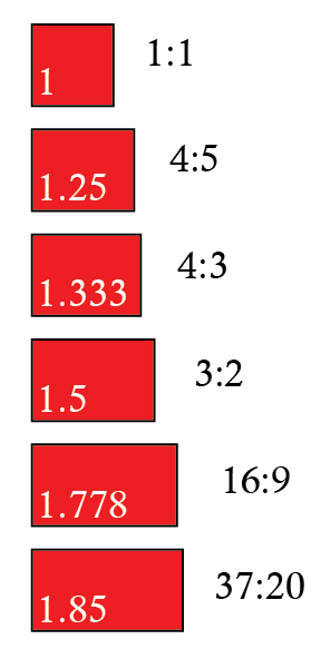
Lastly, let’s talk about aspect ratio. When people talk about aspect ratio, they’re talking about the basic shape of an image. I put together some quick images of some common aspect ratios to help illustrate this point.
A 1:1 aspect ratio is your standard square. As far as common usage in imagery is concerned, you’re likely to run into this in medium format photography and internet avatars.
You’re probably most familiar with a 4:5 aspect ratio from 35mm photography. Think of your 4x5s, 8x10s, and 16×20 pictures. To this day, most picture frames are made to fit this shape.
You may have noticed that most modern digital photographs are longer than your old film photographs (It can be a real pain when you want to frame something.) That’s because most digital cameras shoot at a 4:3 aspect ratio. This is also the shape of many laptop screens (at least the older ones) which is why it’s also the standard shape for Power Point presentations, which are generally done at 1024x768px or 720x540px.
Note* You would use fewer pixels if you didn’t need as high a resolution.
720×480 was the old standard for television. That’s a 3:2 ratio. Another common video size is 1440×1080, also a 3:2 ratio. Technically that would make it HD, which stands for high definition. Definition is another way of saying resolution. But over the past decade, the expression HD has taken on the connotation of also being widescreen.
Modern HDTV is made widescreen, specifically it’s created at a 16:9 ratio. If you’ve ever shopped for an HDTV, you probably noticed the numbers 720 and 1080 come up a lot. That refers to whether you’re getting a resolution of 1280×720, or 1920×1080.
Note* The part about the P or I that gets attached to those numbers refers to whether your image uses progressive or interlaced fields. That’s a video specific thing, and it has to do with how your television transitions from one frame to the next.
This is the aspect ratio for a lot of what you see in the movie theaters. As I understand it, it was a standard developed by Universal Pictures in 1953. Not all movies are set to this ratio, but many are. I’m mostly just including it to point out that widescreen movies in theaters are still usually wider than your widescreen HDTVs at home.
Now some of you may be wondering about the white numbers in the boxes. One way that you can figure out your aspect ratio is to divide the length by the height.
3/2=1.5
720/480=1.5
and so on
If I were a better mathematician, I would write the relationship between these things down for you in mathematical formula. Instead I’m me, so I’ll just tell you to think about the relationship between all of those numbers. An image takes up a certain amount of actual space (image size), and it is made at a specific shape (aspect ratio), and it can be packed lightly or fully with dots or pixels for each increment of that space it takes up.
I would be remiss if I didn’t tell you that there are times when the math doesn’t quite add up, and sometimes you’ll find that your pixels aren’t square themselves. And if you get into that, it’s just more math. Sometimes just knowing that that happens is a good enough leg up to get around any problems that might cause though.
It’s funny, I just started thinking how maybe the first time we ever start doing this kind of math is when we are kids with writing assignments. Whether it’s the one page assignment that we wrote with a little bit bigger handwriting to fill up a whole page with fewer words, or maybe we just started shaving in on our margins, changing the shape of the page. Or that 500 word assignment written with tiny handwriting to save a sheet of paper. We know this stuff. It just gets muddled when too many conflicting numbers get thrown around.
This writer may be getting a bit muddled now as well, with the night getting later and I’m still not sure if I’ve said this all well enough yet. I’m going to have to bid you all goodnight, and I just hope that this has been helpful and not left anyone more confused.
**Addition**
Since I posted this the other night I realized that the blue border that the WordPress template automatically puts around images is rather distracting from doing an actual shape comparison up there. So I’m including a fuller image here below for easier comparison.
Malaria Caught on Tape!
This just in, breaking footage of malaria caught in the act of breaking into and infecting a red blood cell!
This footage comes to us from the Institute of Medical Research out of Melbourne Australia. The invading parasite is called Plasmodium, and it has been known to kill nearly 1 million people worldwide each year.
You can read more about the video here at New Scientist.
http://www.newscientist.com/blogs/nstv/2011/01/malaria-caught-breaking-and-entering-red-blood-cell.html
The Periodic Table of Videos About Elements
It may not be anatomy, but it is science, and a really nice display…
Video Posting
So last night I finally signed up for a Vimeo account. If you’re not familiar with them, these are the guys who’ve basically stepped up the game a bit from YouTube. I posted my Sliding Filament animation there, and it does in fact look better than it did at YouTube even though I still wasn’t able to post my best files. If you’ve ever wondered about the quality difference between the two sites, well here’s a chance to take a compare the same work at both…
At Vimeo – http://www.vimeo.com/9849163
At YouTube – http://www.youtube.com/watch?v=0kFmbrRJq4w
And if not, well then carry on.
TK’s Lab
A few months ago, I posted some microscopic photography work I was learning to do. About a month ago I was handed a camera and asked to get some footage of the man who created those slides in the first place. His name is TK, and you can view the resulting video here if you are interested.
“El Corazón”
This was sent to me a long time ago. If you’re looking for a refresher in basic heart facts, or a refresher in Spanish, this is just the best there is…


