Archive for the ‘award winner’ tag
Award Certificate
Takayuki Hori
So, I was just thinking how it’s gotten awfully technical around here lately, and I should show some more artists’ work for a change of pace again. And then tonight I stumbled into Tatayuki Hori’s Oritsunagumono (things folded and connected), winner of the 2001 Mitsubishi Chemical Junior Designer Award, according to Colossal Art and Design.
I wish that I had a direct website to point you towards for the artist directly, but for all of the blog articles available on his work, I haven’t seen anything from him directly. If any of you reading know of a more direct source, please comment.
As for the project itself, please allow me to copy the description up at Design Bloom…
“each translucent sheet is first printed with either the images of fragments of an animal’s skeleton, or,
on some pages, human-made discarded objects that are often ingested by the animals in the wild.
using the ancient tradition of folded paper, hori assembles the pages into a three-dimensional model.
once the paper is folded, the printed components are united as a whole, telling the visual story
of the animal’s plight to survive in an increasingly polluted and hazardous ecosystem.”
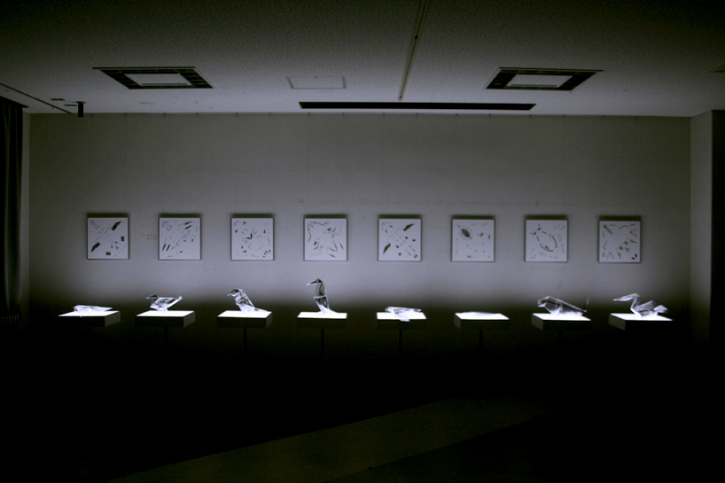
The exhibition at large, looks like this…
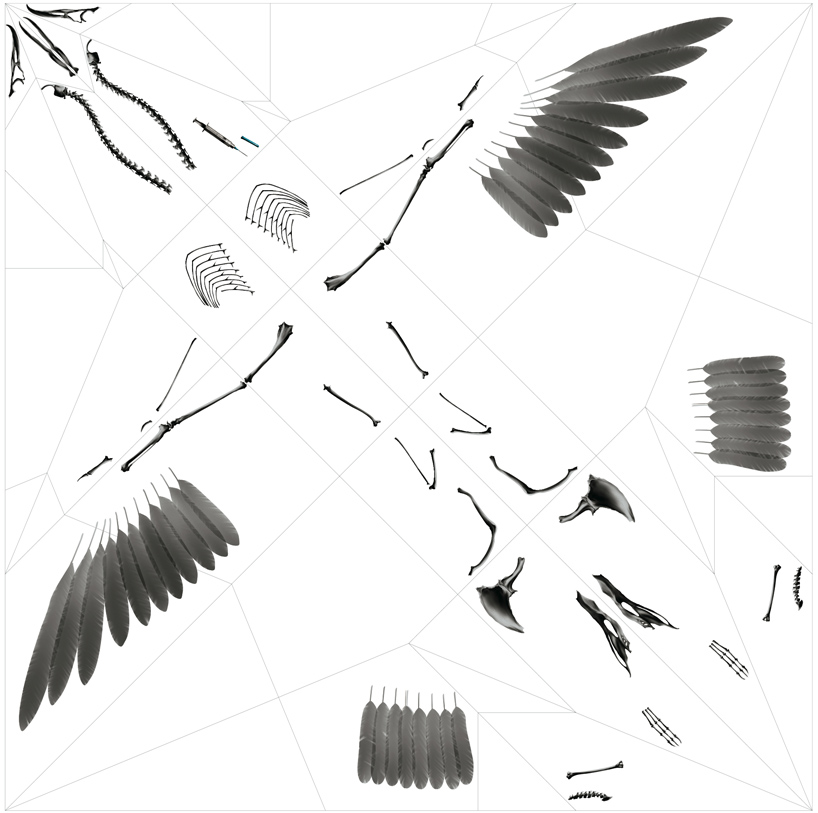
…with each figure underlit so that it emphasizes the translucency and fragility of the piece, and each featured next to a wall hanging of the printing diagram prior to folding.
Here is one of the diagrams.
And here is the 3D model of that same piece.
Impressive work, most certainly.
The Image of Research at UIC
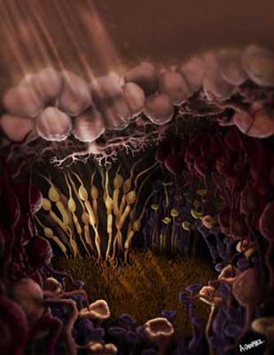
Recently UIC held their annual competition called The Image of Research. The idea is that graduate and professional degree seekers at UIC have the opportunity to submit images of aesthetic appeal along with the connection to that student’s research here at the university. This year, one of my classmates, Annie Campbell, took third place with a piece she did for one of our classes illustrating the photoreceptors of the retina.
Just recently, the following article was released in the UIC news which includes an interview with her. It’s a fantastic piece, and Annie is an incredibly talented artist.
http://www.uic.edu/htbin/cgiwrap/bin/uicnews/articledetail.cgi?id=14385
First place went to Sangyoon Lee for research being done to create a graphical computer interface with a very life like avatar, that can be rendered in real time allowing for real time interactions. In fact, they’re even calling the project LifeLike. So they submitted an image of the man they have been working on showing both the rendered side and also the wireframes. It looks like they are getting some great results.
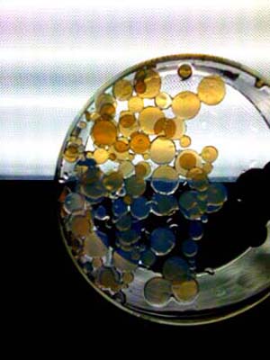
And second place went to Kristin Thomas for her image of an evaporating dish containing an arry of disks cut from PEGDA hydrogels synthesized in their lab. This one is too far outside of my realms of expertise to be able to give much in the way of comment, but I will post the image nonetheless.
Congratulations to everyone who placed in this contest. You’ve all created some great work!
Illustrating Muscle Contraction – Many Ways to Tell the Same Story
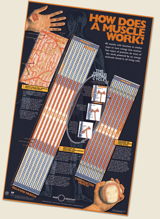
Earlier this week, I wrote about 2007 Visualization Challenge winner, Kai-hung Fung. I couldn’t help but notice one of the honorable mentions went to artists, Mark McGowan, Pat Murphy, David Goodsell and Leana Rosetti for their poster “How Does a Muscle Work.”
It caught my eye primarily because we were assigned the same process to illustrate our first semester in the biomedical visualization program at UIC.
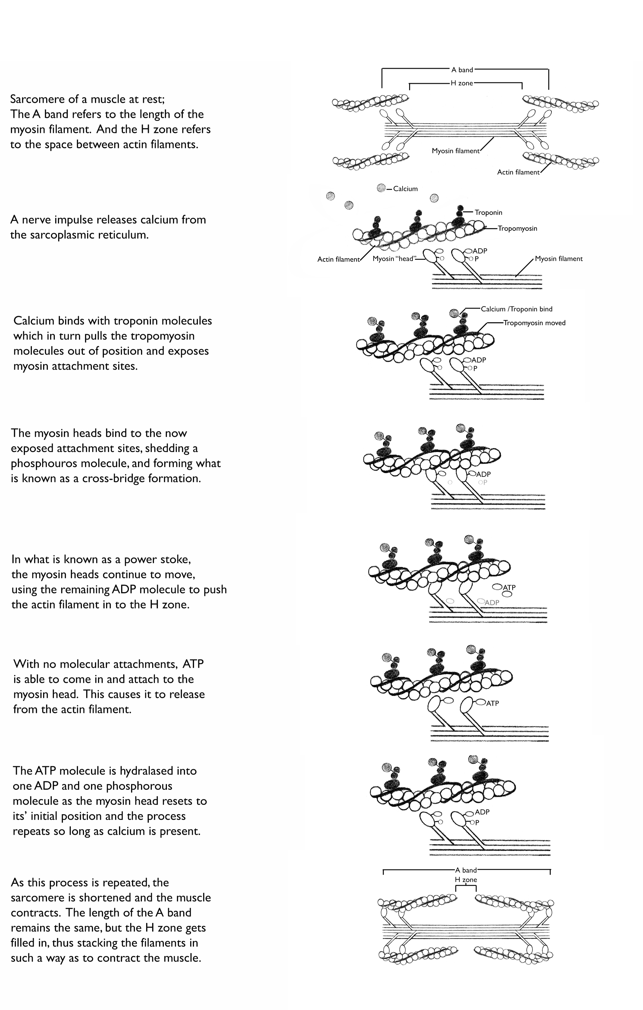
The process of muscle contraction is actually pretty complicated. It is best understood when looked at on both the molecular level, but then also on the level of the actual sliding filaments in order to understand what exactly is accomplished by that molecular action.
My own take on this process for the class, was to use very simple illustrations and explain the steps, with the larger view of the sarcomere at the beginning and end of the process.
Other classmates went about illustrating the process very differently.
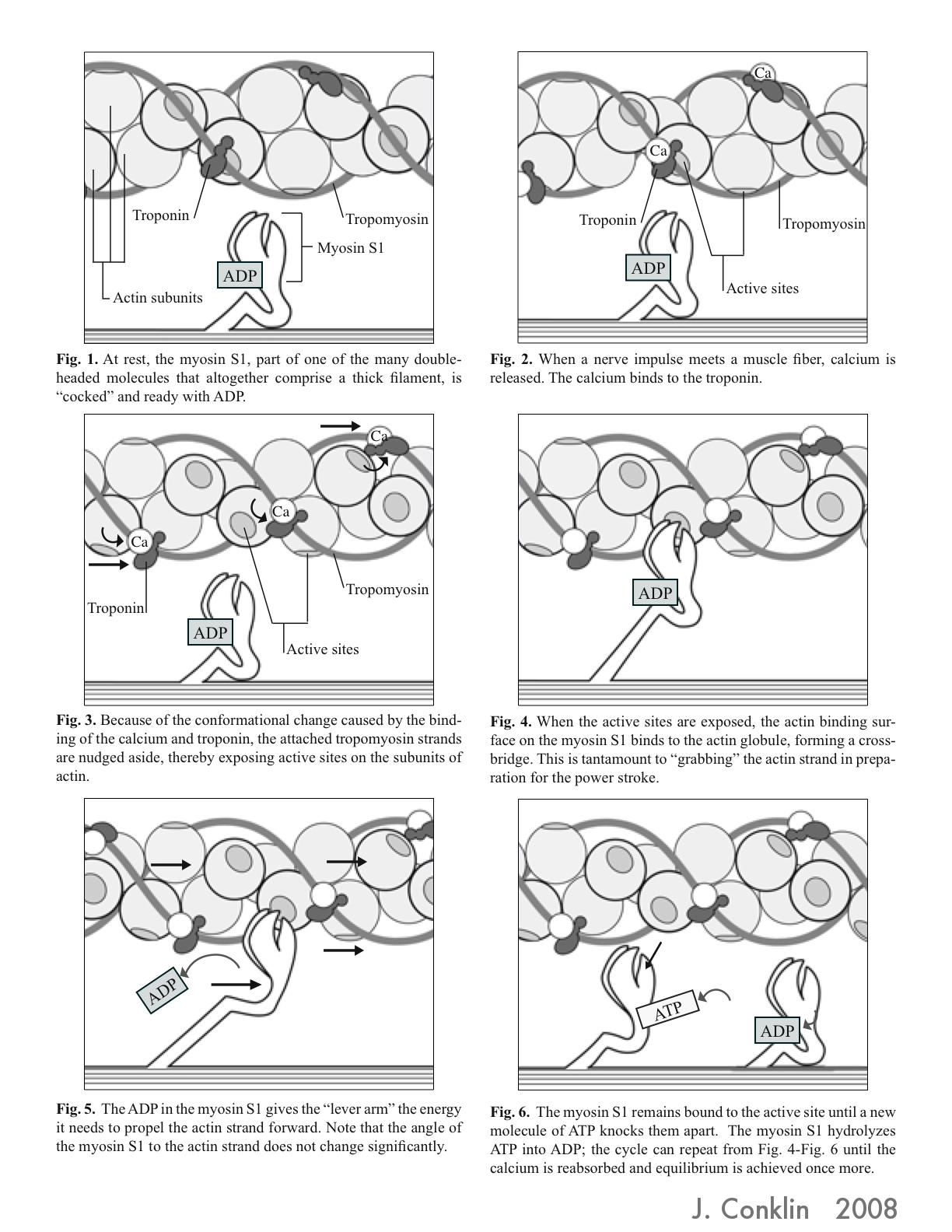
One of my favorites was that of Josy Conklin, who went out of her way to learn the real shape of the myosin head and bring that information into her illustration.
She posts this illustration to her own blog, Josydoodle, which I recommend to anyone who enjoys reading about these kinds of things.
http://josydoodle.blogspot.com/2008/12/myosin-yourosin-hisosin-herosin.html
Other classmates included less of the explaining text, and focused more on dynamic imagery. Some represented the power stroke cycle circularly, to emphasize the repetition involved in the process.
As you can see though, there are many different ways to tell this story. And that, I would say, is one of the primary issues a medical illustrator faces. A medical illustrator not only has to understand the science to be conveyed themselves, but they then have to find the best way to convey that information to the audience at hand, and utilize the media tools available to the specific project. And as with any story, there are many ways one can tell it.
Art from a Scan
Sometimes people send me things; links, images, stories, things related to medical art.
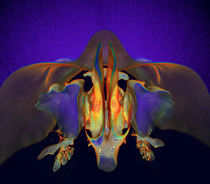
Today someone sent me the winning image of the 2007 International Science and Engineering Visualization Challenge, entitled “What lies behind our nose” created by Kai-hung Fung.
This is a great example of the kinds of things that can be done when scanning technology meets art. The image started as a CT scan from a 33 year old woman, who was being examined for thyroid disease.
I’m not sure what kind of software Fung used here, but if you want to experiment with this kind of art a little yourself, you might start with a freeware copy of OsirX.
http://www.osirix-viewer.com/AboutOsiriX.html
(Sorry PC users, but this one is Mac only)
From there, you have some options regarding what kind of tissue you want to select for, how colors are displayed, as well as the ability to cut pieces away, or turn your model. It takes some getting used to, and I am by no means an expert with this one yet, but the results can be downright cool. It’s also just a nice way to be able to view DICOM images on your own computer. If you don’t have access to any DICOM images, and you still want to try some of this first hand, you can always download one of the sample image sets available.
http://pubimage.hcuge.ch:8080/
You can read more about Kai-hung Fung’s piece, as well as the other 2007 Visualization Challenge winners here.
http://www.sciencemag.org/cgi/content/full/317/5846/1858
